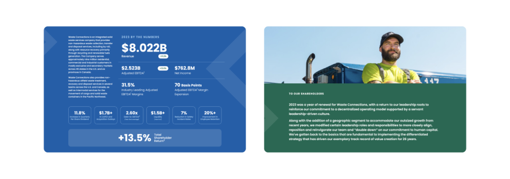
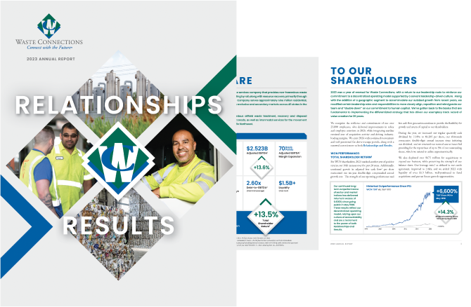
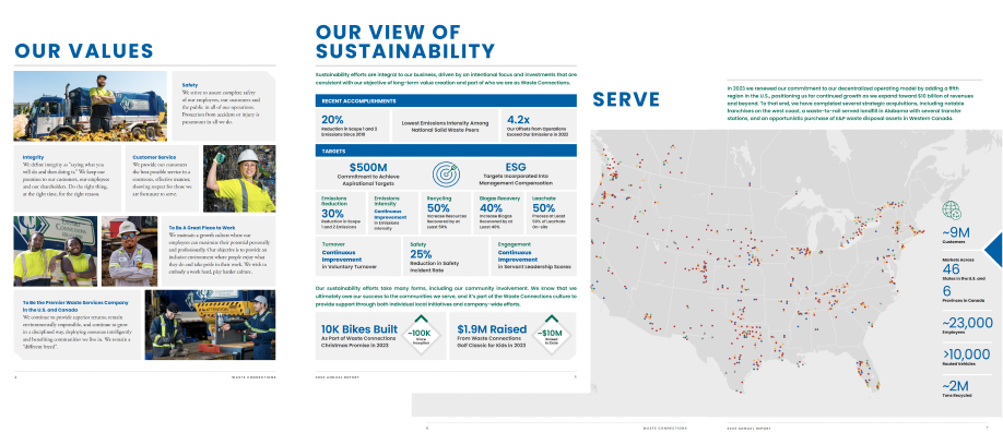
Waste Connections’ annual report was carefully designed to complement the company’s brand and values. Diamond-shaped graphics are a significant part of the design, echoing the shape of the company’s logo and enhancing brand identity.
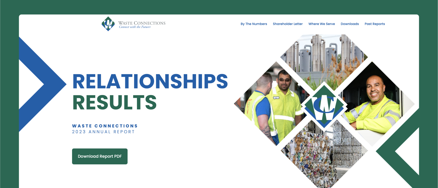
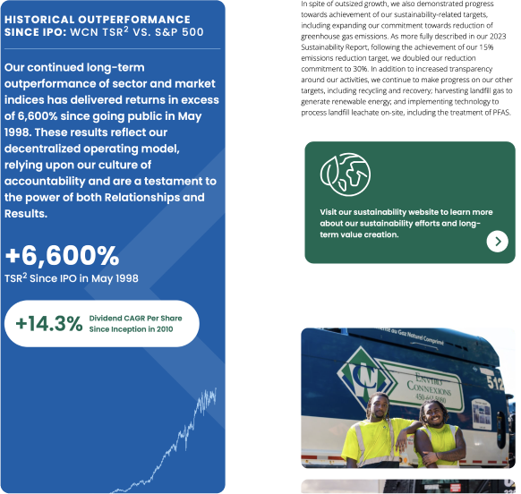
A unified visual experience is produced by the regular usage of this geometric theme in both the printed report and the annual report microsite. With its interactive features and easy navigation, the online microsite enhances the printed edition and enables stakeholders to interact with the content in a dynamic way.
The design places a strong emphasis on Waste Connections’ workforce. The report highlights the company’s dedication to its employees with pictures of its diverse workforce. The purposeful placement of these pictures within the diamond designs represents the crucial part that workers play in the company’s success. The annual report not only conveys financial and operational accomplishments but also humanizes the company, creating a stronger bond with its audience, by highlighting the diversity and commitment of its workforce. This careful approach to design makes sure that the report’s digital and printed versions deliver a strong, consistent message of gratitude and inclusivity.
